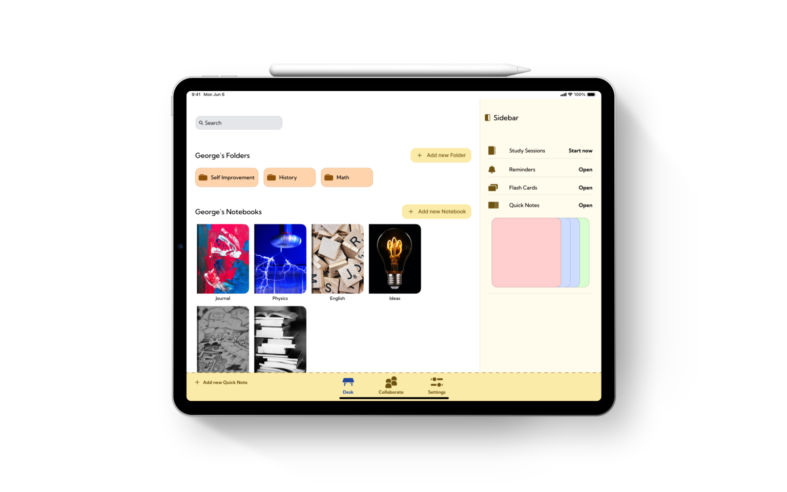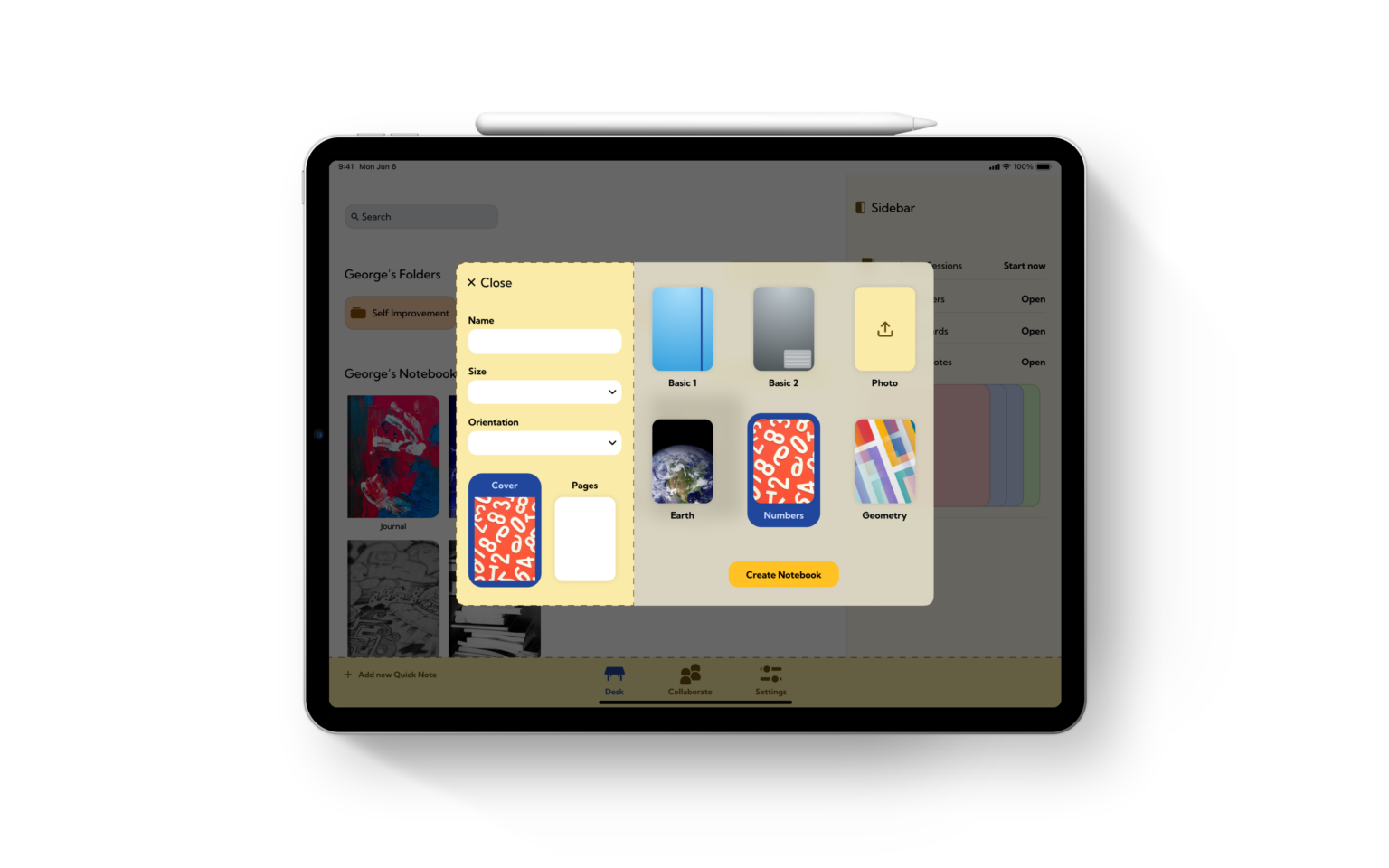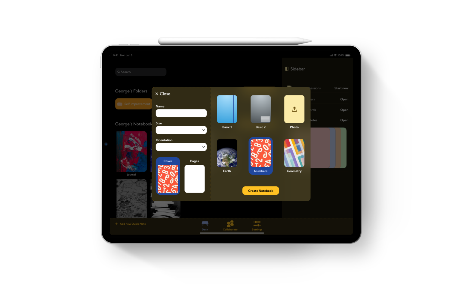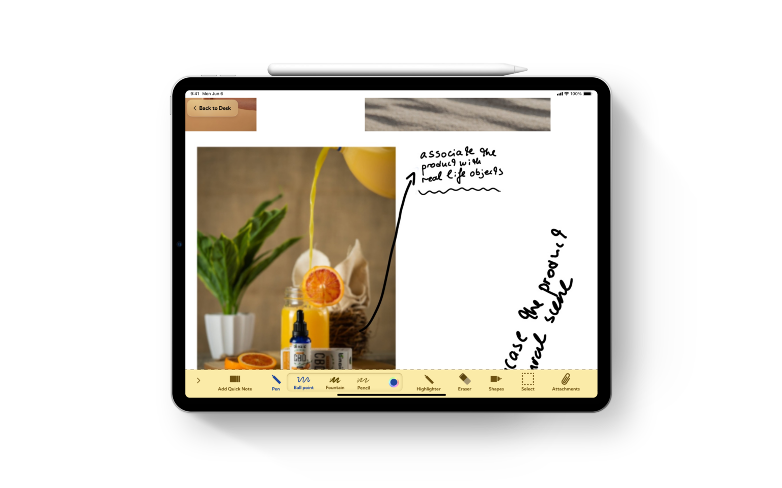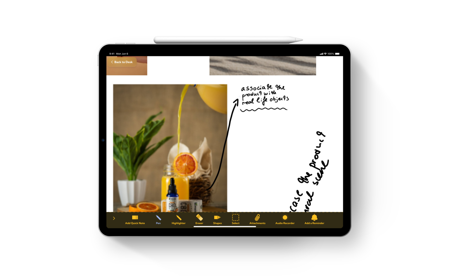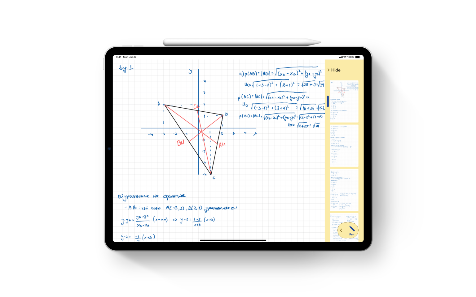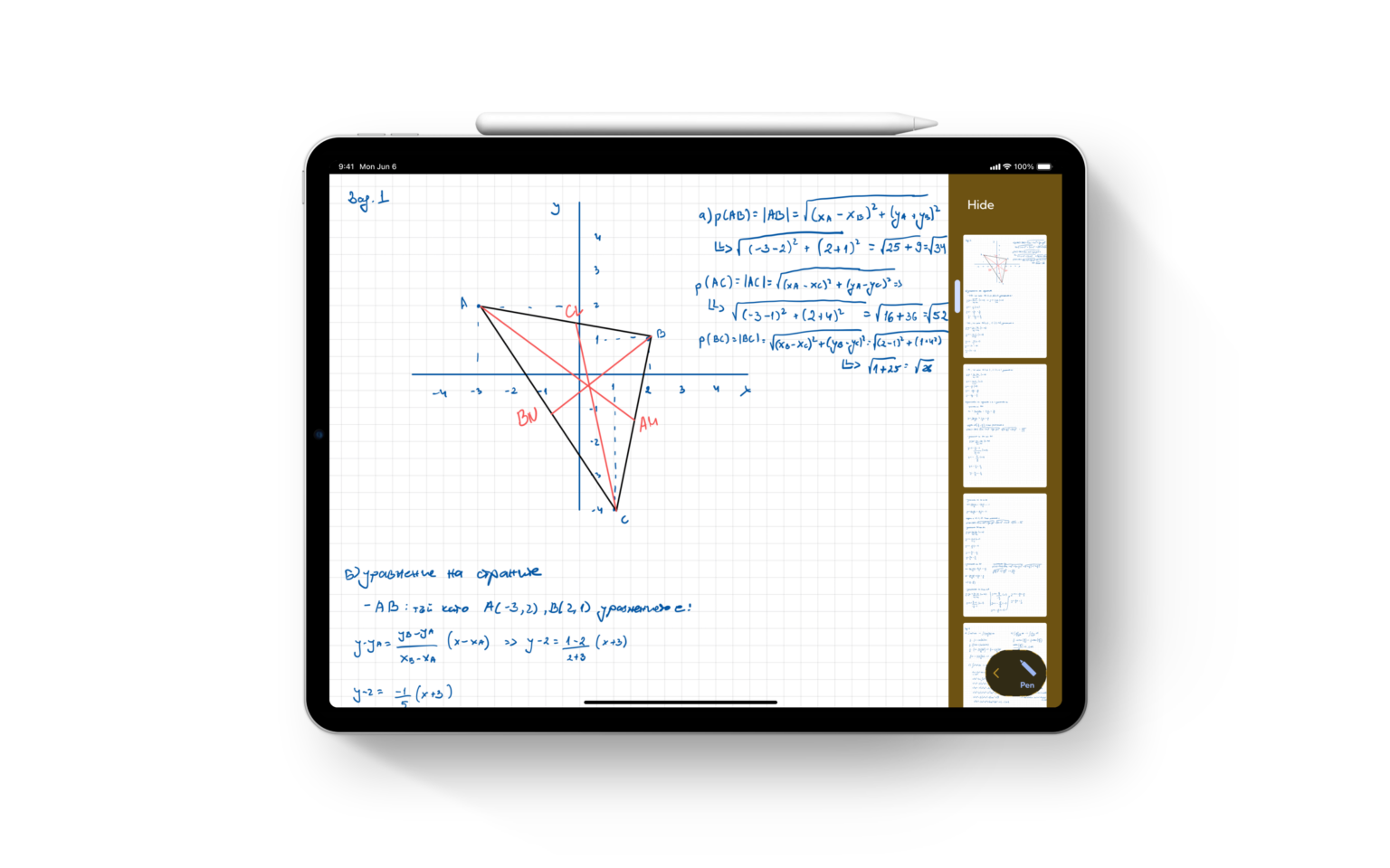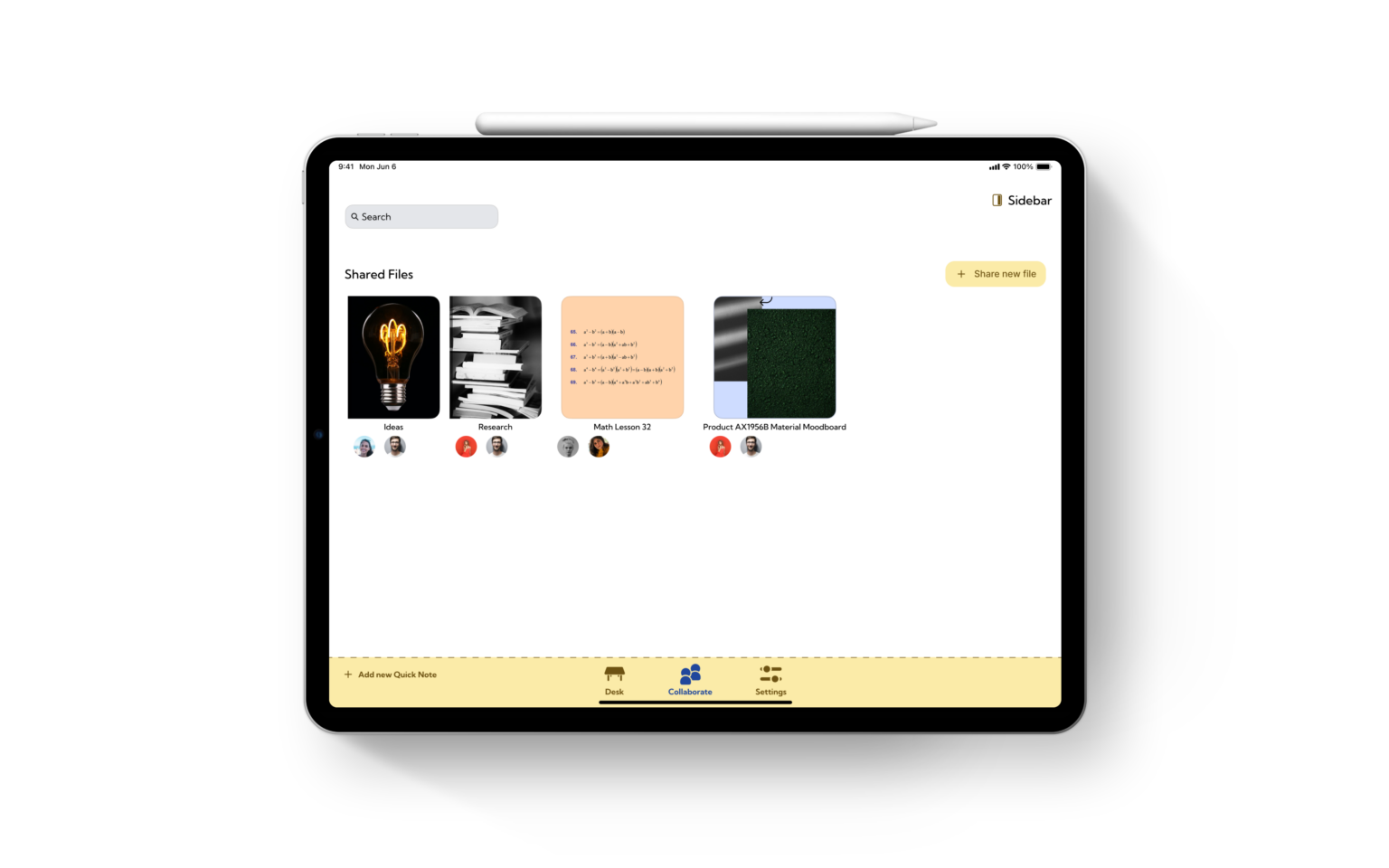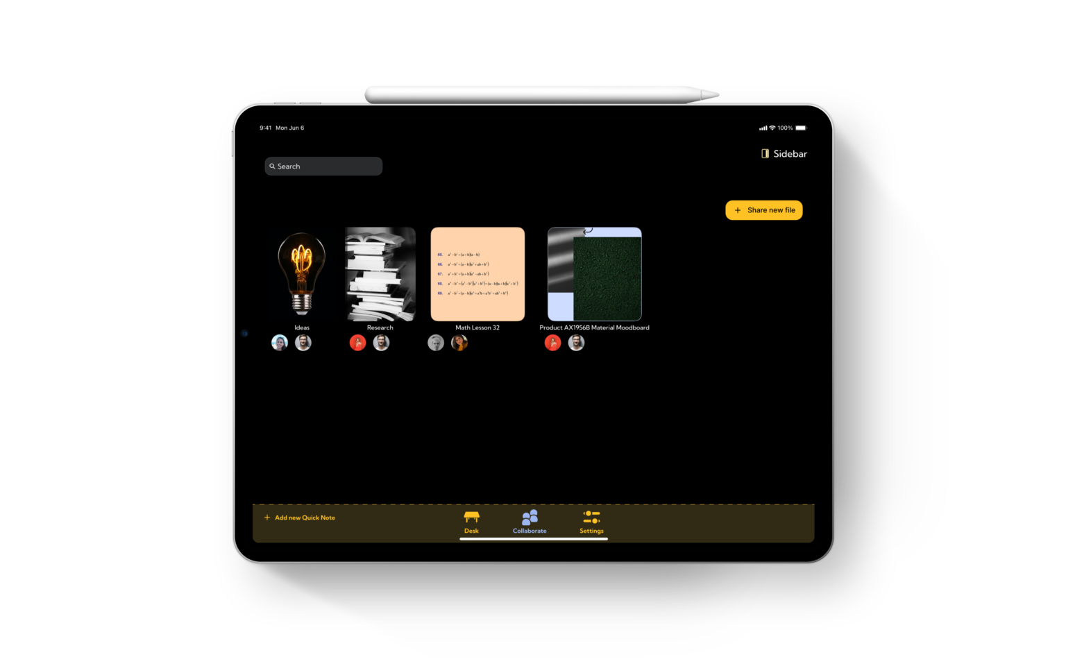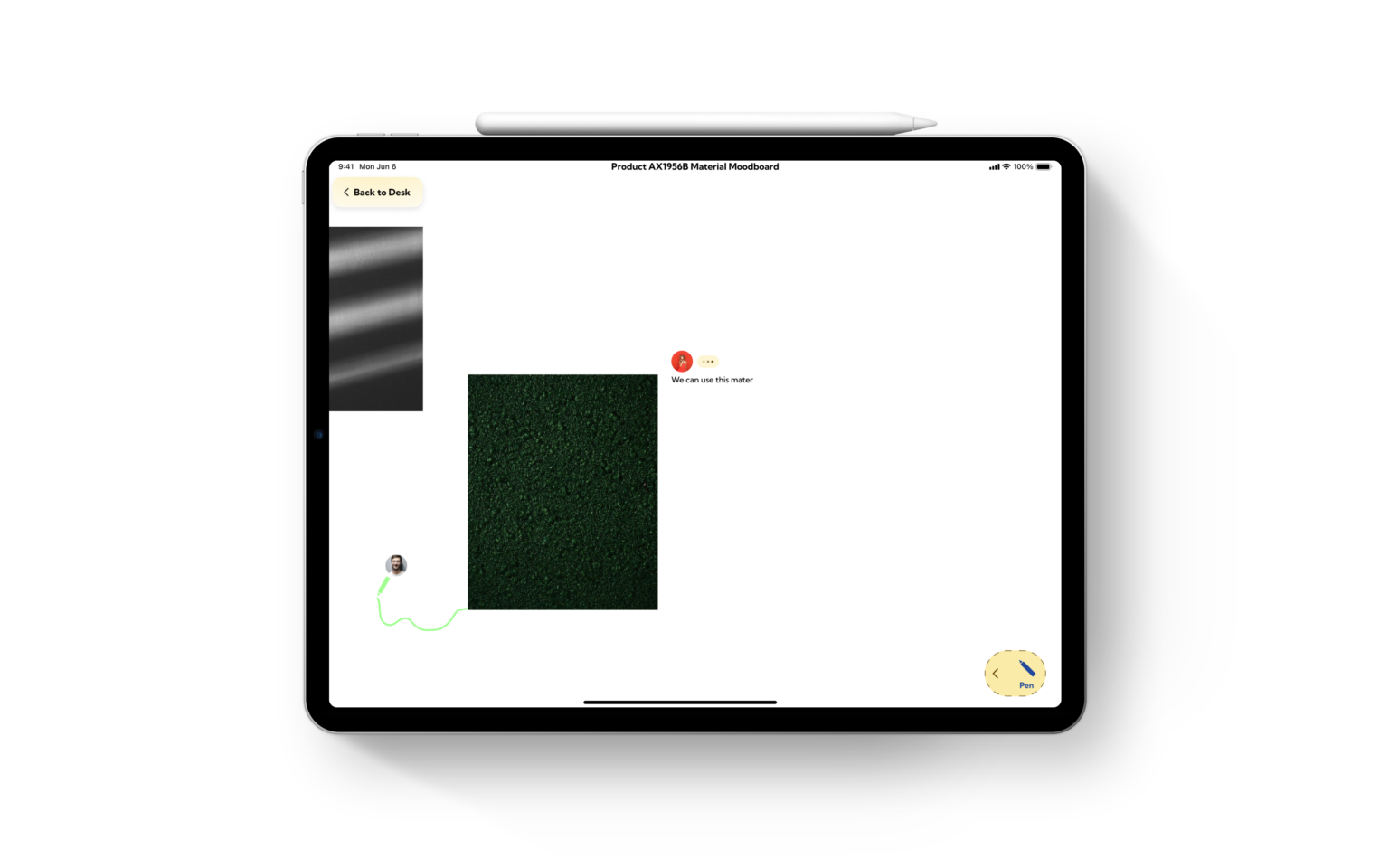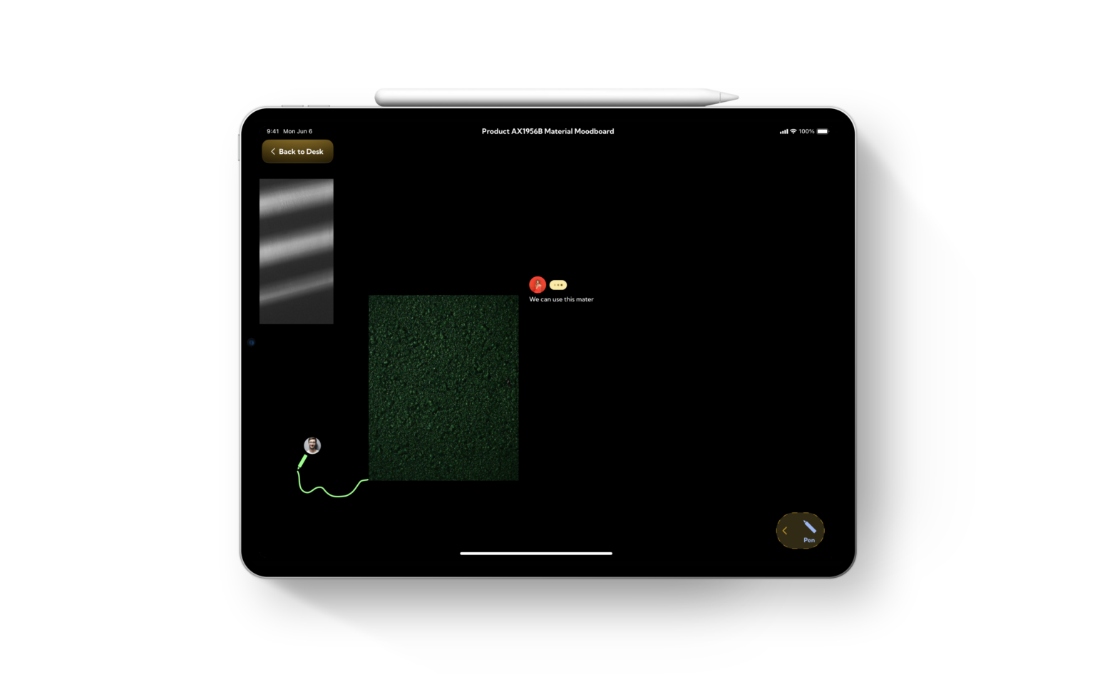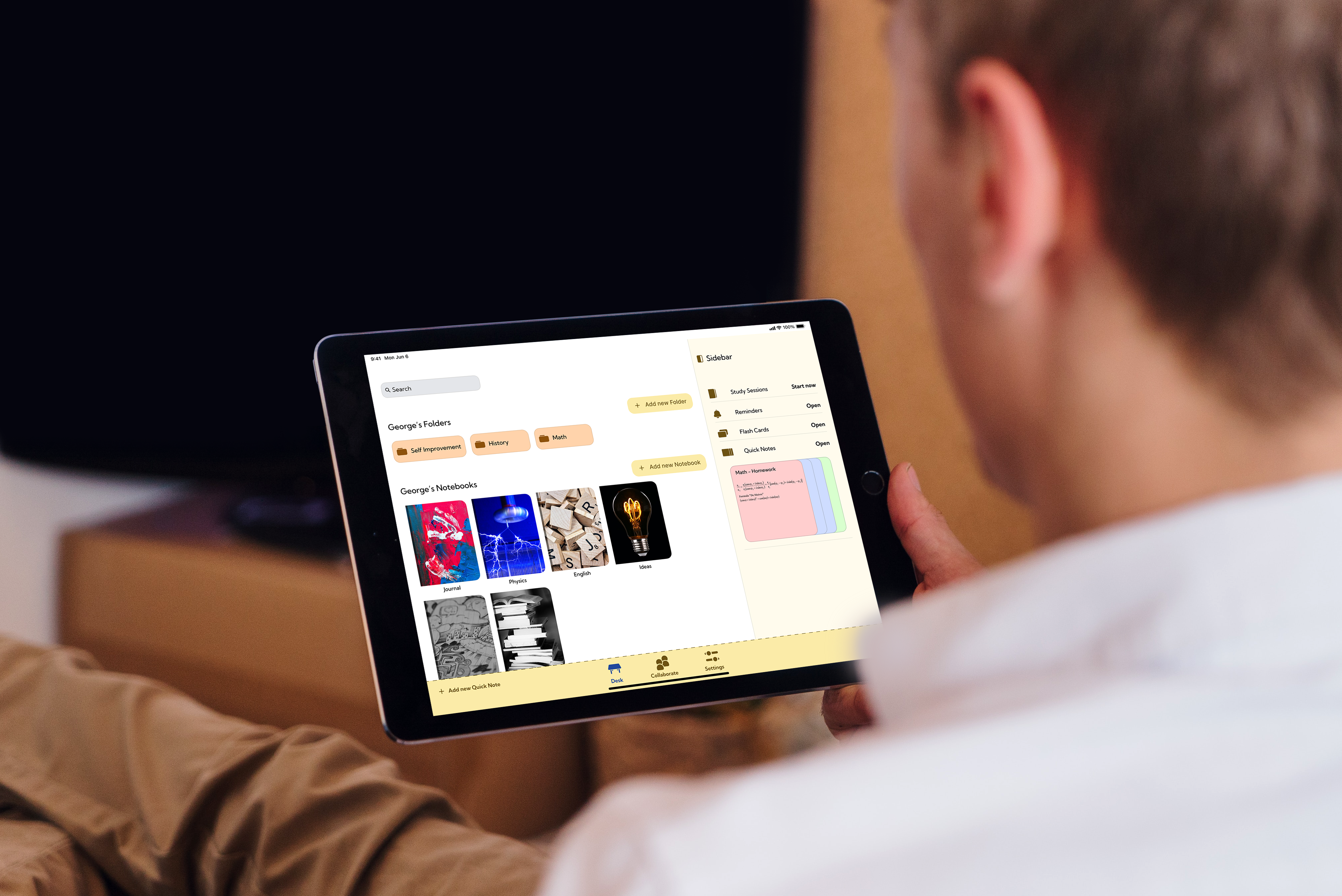
Task - Create a solution specifically for students to help them focus on their studies and move to the digital world.
Role – UX & UI Designer ( User research and competitive analysis, Persona IDs, User Journey, Task and User flows, Wireframes, Design system and prototype ).
Students, Teachers, Designers, Artists, Writers, Lawyers, Engineers, Therapists, Planners, Musicians, Journalists, Managers... You may wonder what all those people have in common. The answer is taking notes. Everybody I know takes notes. Some people may take them to solve mathematical equations, others to solve problems either personal or work-related. There is not a specific answer to the question-what to take notes for? Notes exist in digital and the old-fashioned way - paper. You can use either.
I prefer to take digital notes, but there seems to be a problem. I really miss the paper feel, and sometimes I feel disoriented in the digital world. I started wondering if the issue was personal, but then I asked some of my friends. Some of them felt the same way as me.
Okay, there is a problem. I just have to make something to help students effectively write their notes. What can this something be? I can create a blog filled with articles that teaches students, tips and tricks, or I can create social media profiles sharing stories and short video teaching them those things. But those options were not the answer, mainly because there are hundreds, if not thousands, of businesses doing the same thing. I continued thinking and came up with the idea to create an app for digital note-taking. It was the perfect solution. Yes, there are many competitors, but they all limit students in some way. Some of them get in the way of the note-taking app with their fancy AI features, but is that what students want?
With a problem in mind, I started researching. Of course, I needed to create a research plan. The research plan included using surveys, interviews, competitive analysis, and usability testing. The survey included closed and open-response questions. I had limited access to participants to interview, so the main research method was using surveys. Some insights included the top features to include in our app, the process students use to take notes, and some of the challenges. After I conducted the survey, I had to conduct interviews. All the information I gathered from both methods, I used to create the Persona IDs
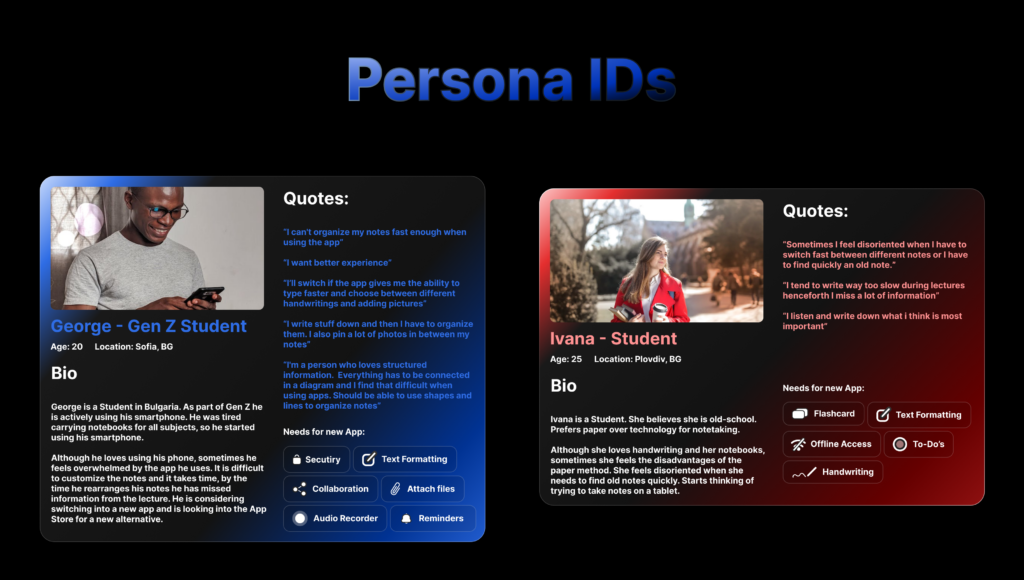
After I created the personas, I had to become an actor. That’s right! I got into George’s Head and started acting. I had to do that so that I could go through the journey of our non-existing app. Yep! This is the journey map my perfect acting skills crafted:
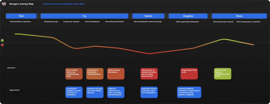
Now I had the idea, a non-defined problem, the research materials, Persona IDs, the perfect Journey, and now all that was left to do was to define the problem, but not my problem, the problem George and Ivana experienced. I used the good old formula – User + Need = Goal. Our personas are students so that is our user. A challenge for me arose because our personas had different backgrounds, but that did not stop me.

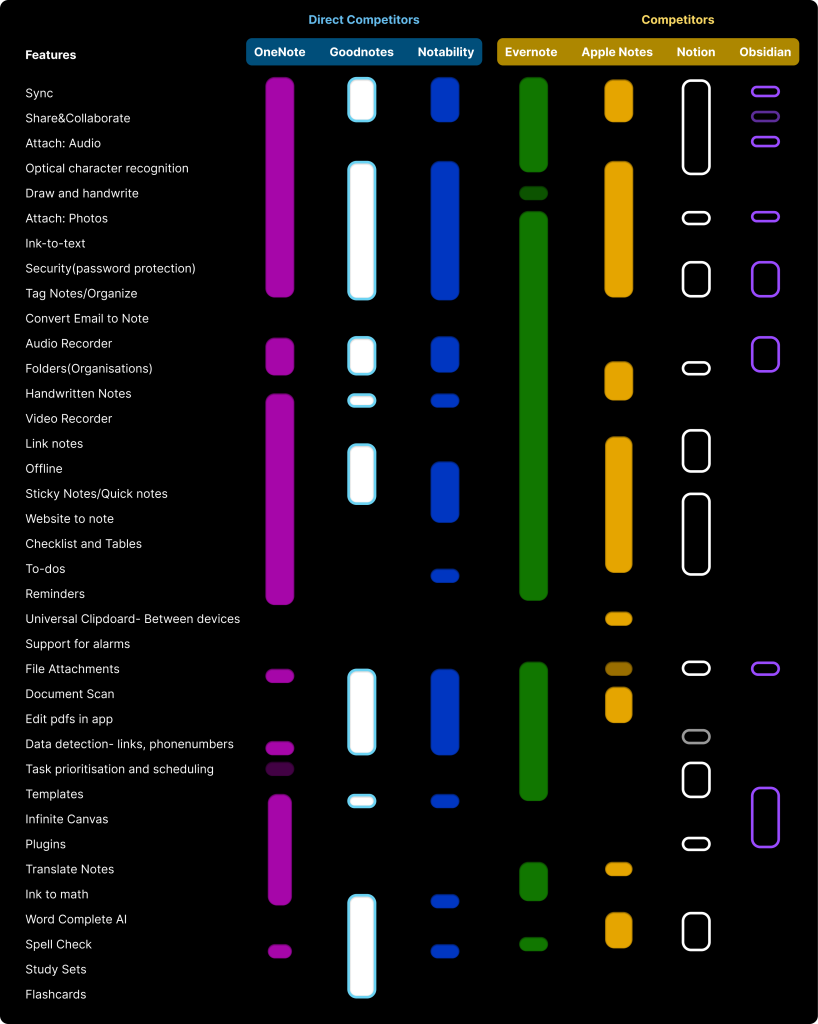
The next significant phase involves conducting a comprehensive competitive analysis. Understanding our competitors, both direct and indirect, will provide invaluable insights into the market landscape. This analysis will guide us in recognizing not just our standing, but also the opportunities and potential pitfalls.
To kick off this vital stage, I've set out to develop a feature list showing the functionalities of our competitors. This will involve a detailed examination of their products or services, highlighting both their unique selling points and areas where they might be lacking.
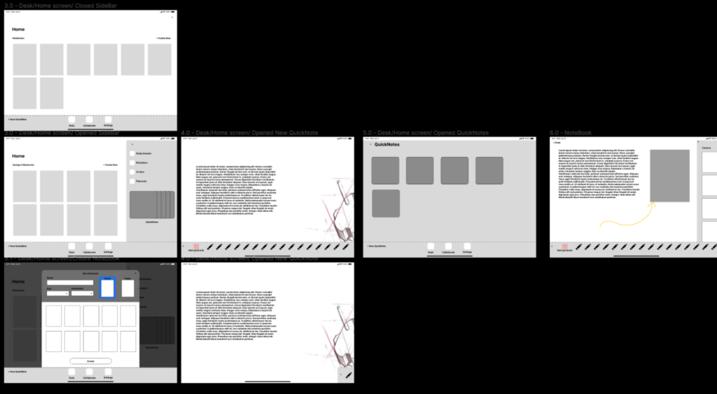
Moving ahead on this journey, to bring the app to life, we created basic wireframes of a few task flows to see how users would interact with it. Our primary focus is crafting an effortlessly user-friendly experience. This led us to usability testing. We've engaged in insightful conversations, closely observing user interactions to enhance their journey.
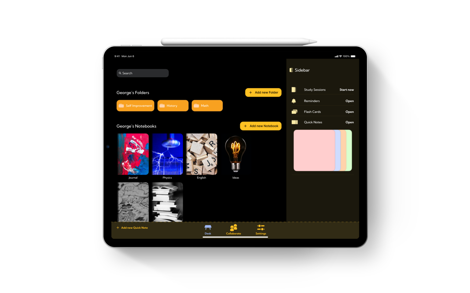
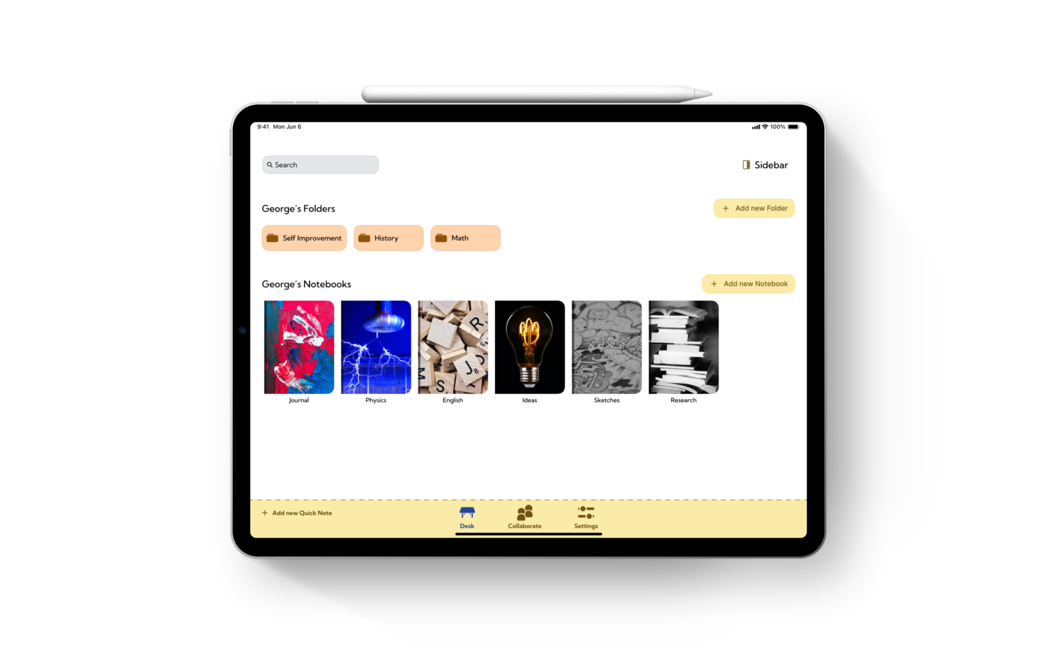
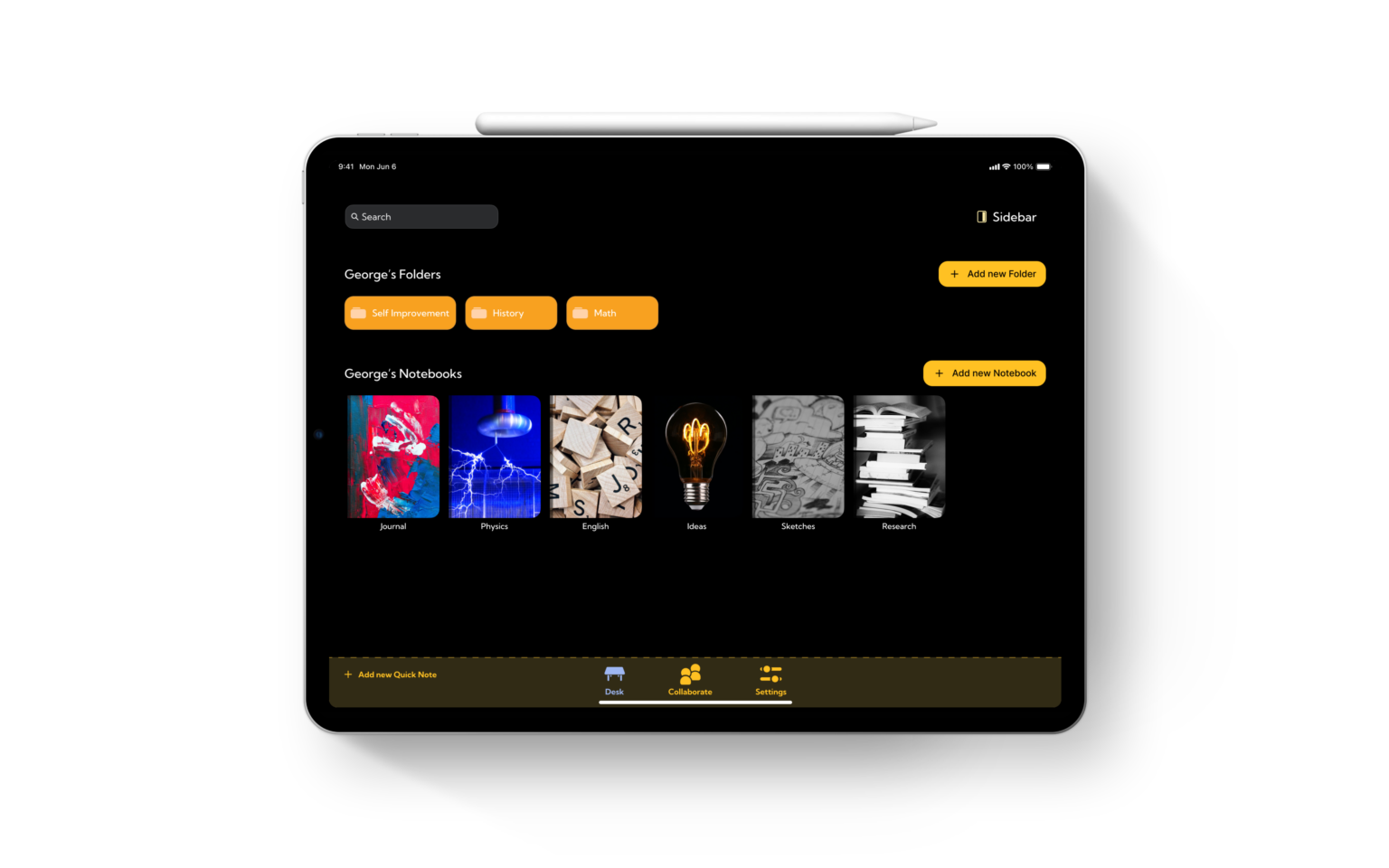
Encountering and fixing a few bumps, I swiftly moved on to the next step—working on the Hi-fi prototypes. While fine-tuning the basic layouts, I started crafting a design system. I chose fonts and put together a complex color system to make it easier to change things later. I used design tokens, giving clear names to each color so we know where it goes and how it's used. It’s all about making future changes smooth and keeping everything in the app looking great and working well for users.
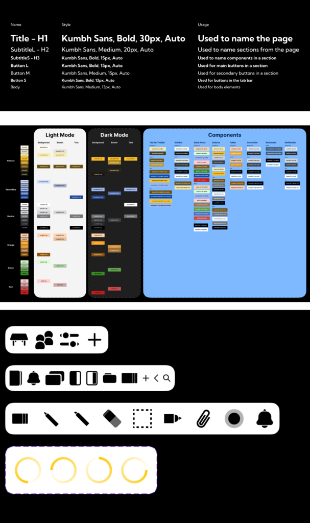
Once I had my essential building blocks, I began shaping the components. It’s like putting together puzzle pieces to create something amazing. Each part is essential, fitting together to build an app that's not just functional, but also a joy to use.
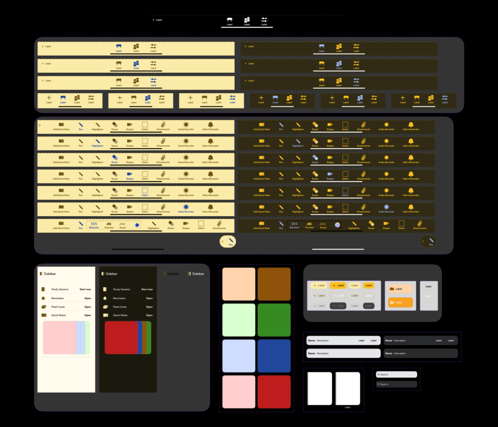
After carefully crafting the entire design system, I integrated these components into the prototypes. It was like putting together a well-thought-out blueprint and seeing it come to life. I implemented auto layout, which ensured that the screens could flex and resize.
And finally, after working for many hours, the end of this journey arrived.
